Zopa Bank Design System

TLDR
The Challenge:
Zopa's "Feel Good Money" brand positioning had outgrown.
Moving into everyday banking with the Biscuit launch required a new brand identity delivered consistently across every product surface. My role was to build the Design System infrastructure that made the rebrand possible — from foundations to launch in 8 weeks.
My Role:
As Senior Design Systems lead, I was responsible for the end-to-end translation of Zopa's new brand identity into a rigorous, scalable component system. I worked cross-functionally across Product Design, Engineering, Brand and Marketing, and collaborated with digital agency Koto to evolve the palette and visual language for digital usability.
The Impact:
New Design System delivered within 8 weeks, ahead of the Biscuit Current Account launch in July 2025.
180 components built across App and Web, using Figma variables with a managed, phased delivery schedule.
95% adoption within the Product Design team with a 0.3% detachment rate across the first full year.
The challenge
In 2019, Zopa launched as a licensed digital bank with the positioning "The FeelGood Money Company".
This was a deliberate attempt to tackle the chronic lack of trust consumers have around money. By 2025, the bank had grown exponentially, moved into new product sets, and was stepping into everyday banking. The brand had outgrown its previous positioning.

The existing Design System had multiple libraries that were difficult to navigate and not organised around how Product teams actually searched for components. A new platform architecture was needed: one that could host new components and patterns, embed the new brand from the foundations up, and empower product teams to build with confidence.
Working in partnership with the digital agency Koto, the new positioning "Better Banking All Round" centred on the idea of "No Wrong Turns": a bank where one good thing leads to another, and anyone can effortlessly make the most of their money.
But a new brand direction is only as strong as its execution at thecomponent level. The existing Design System's components needed to be rebuilt from the foundations up to make the new brand ownable and consistent across every touchpoint in the app.
My role
As Senior Design Systems lead, I was responsible for the end-to-end translation of Zopa's 2025 brand identity into a rigorous, scalable component system — from initial audit and palette stress testing through to phased component delivery for app and web rollout.
Strategy
This required working cross-functionally across the organisation, collaborating closely with Key Stakeholders including:
Product designers — ensuring components were built to support their workflows and could be adopted progressively without disrupting live delivery
Engineering — aligning on tokenisation architecture, naming conventions and implementation handoff
Brand and marketing — maintaining fidelity to the new brand direction while stress testing and evolving the palette for digital usability
Internal comms — communicating the design system evolution across the organisation, ensuring every team understood what was changing, when, and how to adopt it
Koto — The specialist digital agency engaged to support visual design language execution and collaborative palette refinement
Ownable brand position
The shift in design language is significant: from a functional, subdued fintech aesthetic to a bold, optimistic visual language built around Zopa's new "Better Banking All Round" positioning.
The new palette — mint/teal, warm yellow, coral/orange — gives the brand the visual stopping power needed to cut through in an increasingly crowded current account market.


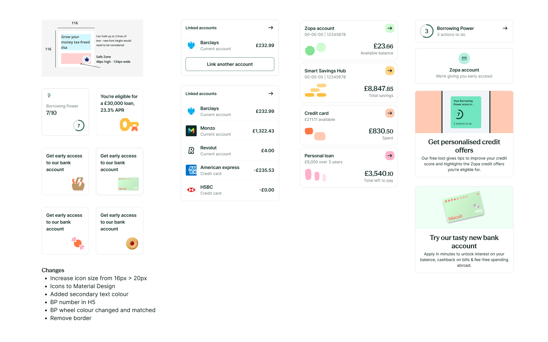
New component design language
The scope went significantly beyond a visual update. Reviewing approximately 120 components created an opportunity to look holistically at how each was built, behaved and documented — not just how it looked.
For each component, the audit asked:
Does this accurately reflect the new visual language — Optimistic, Refreshing, Flowing?
Are there functional improvements — interaction patterns, states, edge cases, accessibility?
Is this documented clearly enough for product designers to adopt confidently?
This dual lens — visual and functional — meant the system that shipped wasn't just rebadged. It was meaningfully improved across the board, with improvements documented throughout.


From brand to system process
The new brand pillars needed to be translated from brand-level intent into rigorous, repeatable component behaviour.
Working with Koto, I stress tested the new visual language against real product scenarios: edge cases, accessibility thresholds, interactive states and content variation across all components.
This process revealed where the palette, as defined by the brand needed to evolve to function digitally — where contrast ratios fell short, where colour relationships broke down at scale, and where the brand intent needed interpretation. Rather than compromising the components, I worked with the agency to propose palette refinements that preserved the brand intent while making the system genuinely usable, accessible and scalable.
Figma variables and tokenisation
The system's foundations were rebuilt using a structured tokenisation approach in Figma:
Colour tokens — new semantic colour system, replacing ad-hoc values with a structured, maintainable token architecture reflecting the new palette
Figma variables — introduced to manage theming, mode switching and token relationships across the system
Spacing system — new scale defined and applied consistently across all components
Border radius — standardised across interactive and container elements
Type styles — new typographic scale introduced alongside a new typeface, Seasons Sans and Season Mix


Staying ahead of product design
A critical principle throughout was that the Design System team needed to be ahead of product design delivery at all times.
If product designers reached for a component before it had been evolved and delivered, the system would become a blocker — jeopardising the July launch.
The delivery was managed as a structured, prioritised rollout, sequenced by which components would be needed first by product designers. Working with design leadership, the schedule was communicated clearly across teams so everyone knew what was available, what was coming, and how to adopt new components as they landed.
Brand guidelines settled: March 2025
Component delivery: March — June 2025 (phased, ahead of product design)
App launch: July 2025 — aligned with Biscuit current account
Launch and Impact
The new design system was delivered within an 8-week window, ensuring product teams across the organisation could adopt new components and patterns ahead of the critical Current Account launch in Summer 2025.
Close to 180 components were delivered and ready for product teams to consume.
The adoption trajectory was strong with usage rising consistently, and peaked during rollout in Q3/Q4, and stabilised into sustained operational usage. The Design System had become infrastructure, not a project.
315k component inserts across the first full year.
that ~0.3% detachment rate with teams were trusting the system and building with it.


© 2026 Simon Wessely