Fintech Pledge 2025

TLDR
The Challenge:
Millions of people across the UK remain financially fragile.
The Fintech Pledge 2025 was founded to strengthen consumers through collective action at scale.
The initiative required an online presence to communicate its positive actions and principles, while providing a home for relevant articles, white papers, and resources to actively support people's financial resilience.
My Role:
Working with Zopa's brand and marketing team, I led the creative direction for the responsive multi-page web microsite.
This included owning the full experience and visual direction, through to component theming, typography, colour, and navigation for what was effectively a standalone brand presence, while working within the Zopa component library.
The Impact:
Designed and delivered a full microsite within a three-week design sprint cycle.
25 million+ actions supporting UK consumers' financial resilience, meeting and exceeding the original target.
6 million views and 39,000 clicks for the Master My Money content hub.
The challenge
Millions of people across the UK remain financially fragile. Despite the fintech industry having the products and tools to help, effort was fragmented and no single organisation could reach people at the scale the problem demands.
In late 2022, Zopa and ClearScore launched the 2025 Fintech Pledge to change that.
The founding rationale was explicit: collective, coordinated action across the industry could achieve what no single organisation could alone.
The Pledge united UK fintechs including digital banks, charities, consumer organisations, and industry bodies around five pillars: Savings, Credit, Debt, Bills, and Benefits, with a shared, public commitment to drive 25 million consumer actions that would build financial resilience across the UK.

For the initiative to recruit members and communicate its mission publicly, it needed a web microsite that could:
Explain the principles and commitments member organisations were signing up to
Present the growing coalition of co-sponsors with credibility and depth
Show real-time progress toward the 25 million actions target
Provide a clear route for prospective members to engage
The design challenge was distinct from the initiative's mission. The design brief arrived with almost nothing to work from visually besides a logo mark.

My role
As Design Lead on this microsite, I designed the responsive multi-page microsite, working collaboratively with Zopa's brand and marketing teams throughout.
The project spanned information architecture, brand translation, component design, navigation, and live data integration, a considerably broader brief than a standard campaign page build.
Adopting a lightweight brand application
Structuring the site-map
New component design language
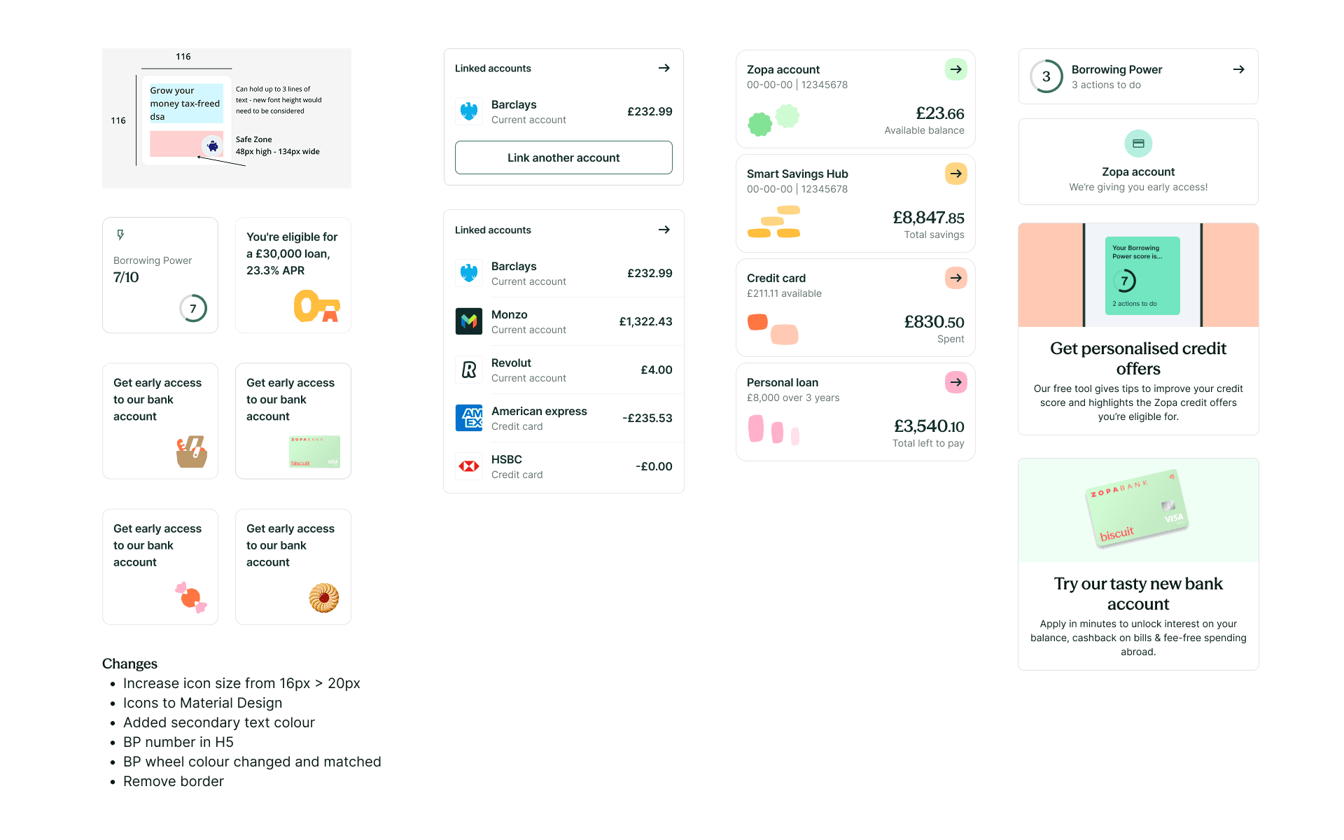
The scope went significantly beyond a visual update. Reviewing approximately 120 components created an opportunity to look holistically at how each was built, behaved and documented — not just how it looked.
For each component, the audit asked:
Does this accurately reflect the new visual language — Optimistic, Refreshing, Flowing?
Are there functional improvements — interaction patterns, states, edge cases, accessibility?
Is this documented clearly enough for product designers to adopt confidently?
This dual lens — visual and functional — meant the system that shipped wasn't just rebadged. It was meaningfully improved across the board, with improvements documented throughout.


From brand to system process
The new brand pillars needed to be translated from brand-level intent into rigorous, repeatable component behaviour.
Working with Koto, I stress tested the new visual language against real product scenarios: edge cases, accessibility thresholds, interactive states and content variation across all components.
This process revealed where the palette, as defined by the brand needed to evolve to function digitally — where contrast ratios fell short, where colour relationships broke down at scale, and where the brand intent needed interpretation. Rather than compromising the components, I worked with the agency to propose palette refinements that preserved the brand intent while making the system genuinely usable, accessible and scalable.
Launch and Impact
Designed and delivered a full microsite within a three week design sprint cycle. Once completing its three year vision, the initiative had collectively delivered:
25 million+ actions supporting UK consumers' financial resilience, meeting and exceeding the original target, itself raised from 10 million in January 2024
Millions of people supported in accessing credit.
6 million views and 39,000 clicks for the Master My Money content hub
650+ participants attended The Money Charity financial resilience workshops funded by the Pledge


© 2026 Simon Wessely